App Builder @ Rewst
Description
A low-code app editor to build custom internal tools.
Context
The Rewst App Builder needed to evolve from a powerful but complex tool into a more accessible and modern experience for both technical and non-technical users. I worked on incrementally improving the platform by simplifying the drag-and-drop editor, making native components more customizable, and modernizing layout and visual styling. The work focused on reducing friction through clearer onboarding and empty states, improving layout flexibility for forms, tables, and containers, and enabling a hybrid method that combines native components with custom HTML when needed. These improvements increased usability, accelerated app setup, and positioned the App Builder as a more scalable and competitive part of the Rewst platform.
Role
Senior Product Designer
Skills
User ResearchProduct StrategyUX DesignUI DesignPrototypingDesign SystemTools Used
FigmaNotionWhimsicalShortcut
Overview
Modernizing app creation at Rewst.
The Rewst App Builder enables users to create internal tools and interfaces on top of automated workflows, but its growing power came at the cost of usability. Originally designed with technical users in mind, the experience became increasingly complex and difficult to grasp for non-technical users.
This project focused on evolving the App Builder into a more accessible, flexible, and visually modern platform, one that preserves its advanced capabilities while dramatically lowering the barrier to entry. Through incremental, system-level improvements, the redesign established a scalable foundation for long-term growth and broader adoption.
Goals
Lower the barrier, raise the ceiling.
Over time, the App Builder accumulated complexity as new features were added to support advanced use cases. Customization often required HTML or CSS, layouts were difficult to control, and core actions were spread across disconnected panels and controls.
Non-technical users struggled to understand where to start, how components related to one another, and how to achieve common layouts without breaking the experience. The lack of cohesive styling, weak onboarding, and fragmented customization options resulted in a tool that felt powerful but unintuitive and increasingly hard to scale.
The primary goal was to make the App Builder approachable for non-technical users without limiting what advanced users could build. This meant simplifying the drag-and-drop experience, improving visual styling, and introducing clearer structure across layouts, components, and configuration panels. Success was defined by faster app creation, greater flexibility without code, clearer onboarding and empty states, and a system that could scale with future features. The redesign aimed to balance opinionated defaults with extensibility, ensuring consistency while still supporting complex, real-world use cases.

Research
Designing for builders with very different skill sets.
The App Builder serves a wide spectrum of users, from highly technical MSPs to operators with little to no coding experience. Through alpha user feedback and interviews, we identified a recurring tension: users wanted powerful customization, but only if it felt approachable and predictable.
Non-technical users struggled with where to begin, how styling worked, and when custom HTML was required. More advanced users, on the other hand, wanted flexibility without fighting rigid layouts or inconsistent components. These insights highlighted the need for clearer mental models, stronger defaults, and progressive disclosure of complexity.
Journey
Finding friction in the building experience.
Mapping the user journey revealed that most friction occurred early in the app creation process. Users often felt lost when faced with an empty canvas, unsure how pages, components, and styles were meant to work together.
Key moments like adding the first component, configuring layouts, and previewing the app, were critical to user confidence and adoption. These insights guided the redesign toward clearer onboarding, more intentional empty states, and a more structured editor experience that supports users at each stage of the journey.
Market
Learning from the best, and their limitations.
To better understand expectations around app builders and low-code tools, I analyzed a range of competing platforms with varying levels of complexity and target users: Webflow, Zapier, Bubble, Wix, Squarespace, Weweb, Momen, Superblocks and Budibase. Many excelled at approachability, offering polished drag-and-drop experiences and clear visual structure, but often fell short when it came to flexibility or advanced customization.
More powerful tools tended to expose too much complexity upfront, relying heavily on code or deeply nested configuration panels. These findings helped clarify Rewst's opportunity: combine the accessibility and visual clarity of modern builders with the power required for real-world, production use cases.
Principles
Balancing simplicity and power.
A clear set of design principles guided every decision throughout the project. The experience needed to feel simple at first glance, while remaining flexible enough to support complex layouts and advanced use cases.
Key principles included progressive disclosure of complexity, consistent and predictable patterns, and opinionated defaults that help users succeed without over-configuration. Rather than forcing users to make every decision upfront, the system encourages building momentum first, then refining details as needed.
Approach
From developer-first to user-centered.
The redesign rethought the App Builder more as a visual and structured environment than as a basic collection of tools. Instead of exposing every option at once, the experience was reorganized around clear building blocks, intentional layouts, and contextual configuration.
This shift allowed non-technical users to confidently assemble apps through drag-and-drop interactions, while still giving advanced users access to deeper customization when needed. The result is an editor that feels guided and approachable, without sacrificing the flexibility required for complex internal tools.
Wireframes
From exploration to execution.
The redesign progressed through multiple iterations, starting with low-fidelity wireframes to explore structure, flow, and interaction patterns. These early concepts allowed for rapid feedback and alignment with product and engineering before investing in visual polish.
Once the foundations were validated, the work evolved into high-fidelity designs that aligned with Rewst's design system. This iterative process ensured that decisions were intentional, grounded in user needs, and ready for production without sacrificing speed or quality.
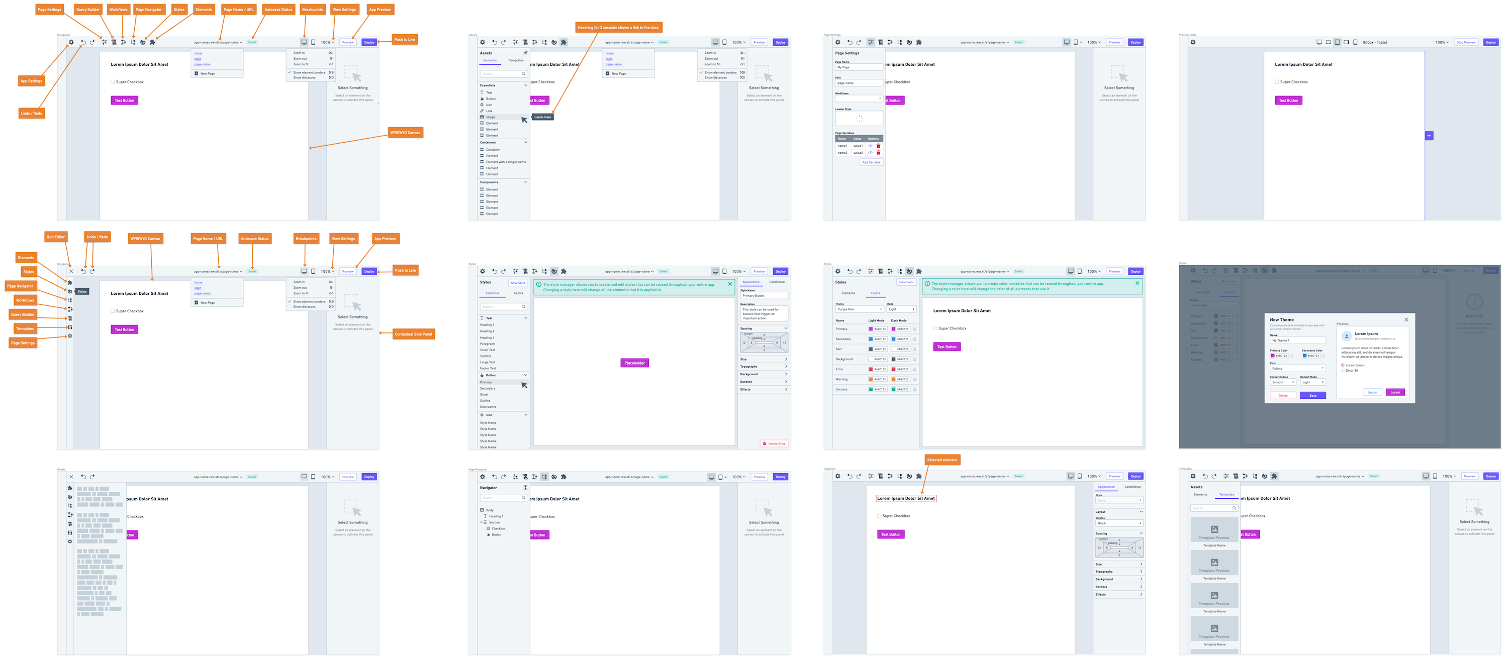
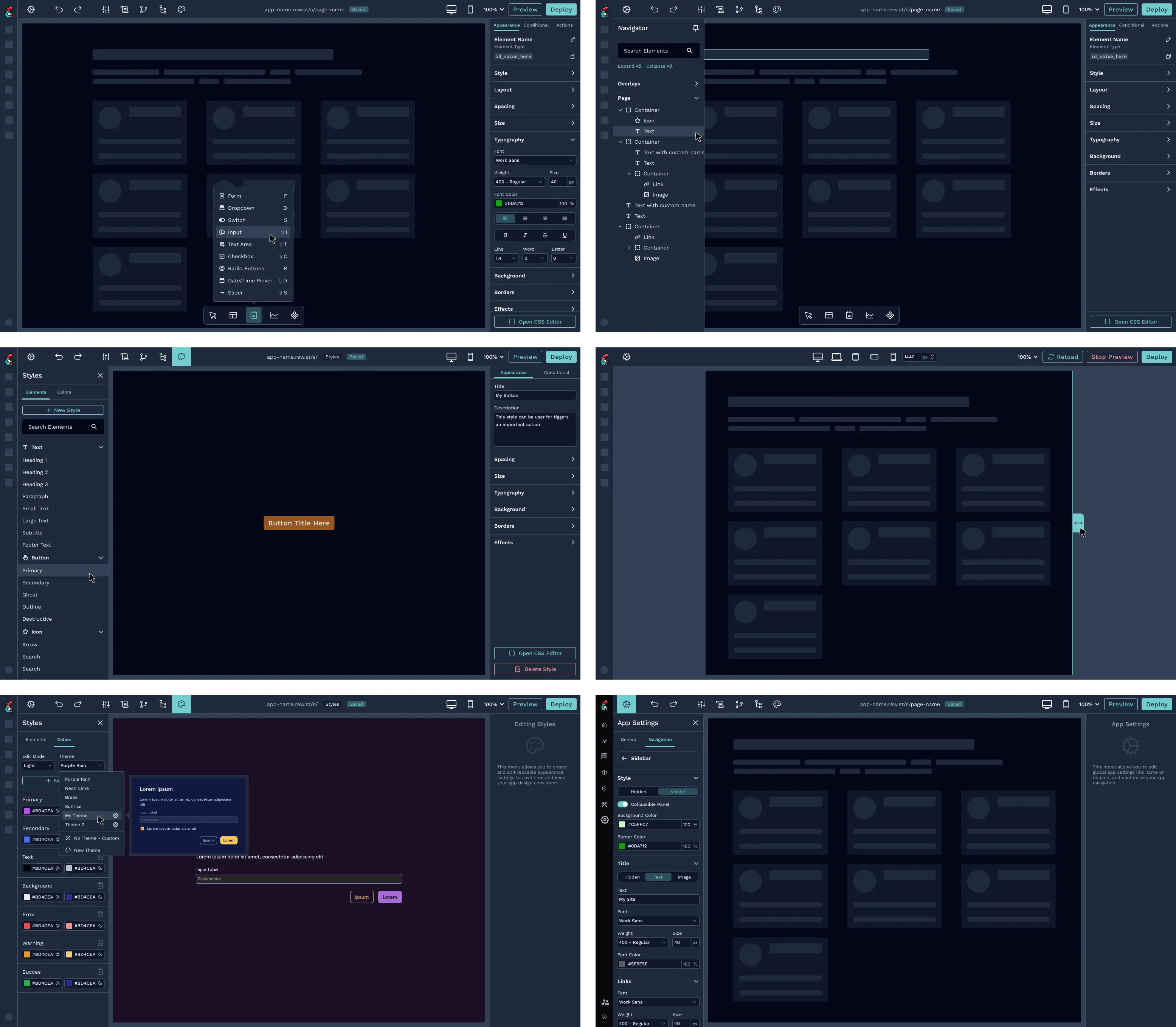
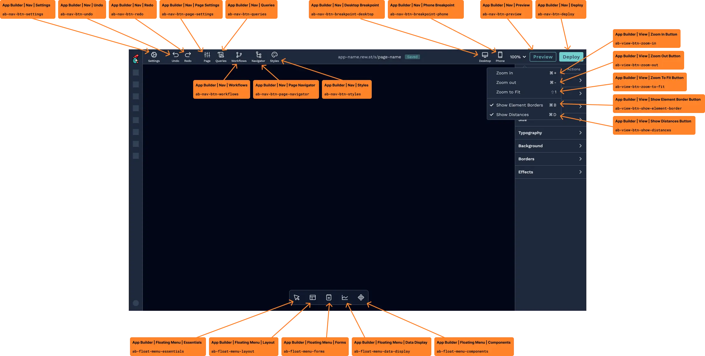
The App Builder is composed of multiple moving parts, so establishing a clear and predictable architecture was critical. I reorganized the editor around a central canvas, supported by purpose-driven panels for navigation, configuration, and styling.
Each area of the interface has a clearly defined role: the canvas for building and layout, inspectors for configuration, and supporting menus for discovery and structure. This separation reduced cognitive load, made the system easier to learn, and allowed users to focus on one task at a time without losing context.
System
A cohesive toolkit for building with confidence.
The App Builder experience is powered by a set of tightly integrated tools, each designed to support a specific stage of the building process. System-level actions live in the top navigation, while creation and configuration happen closer to the canvas through contextual panels and menus. This separation helps users understand the scope of their actions and keeps the interface focused and predictable.
Discovery and structure are handled through the floating elements picker, components menu, and page navigator. Together, they allow users to add new elements, reuse predefined components, and manage multi-page apps without losing orientation. These tools rely on familiar mental models and clear labeling, making it easier for users to move from an empty canvas to a functional layout quickly.
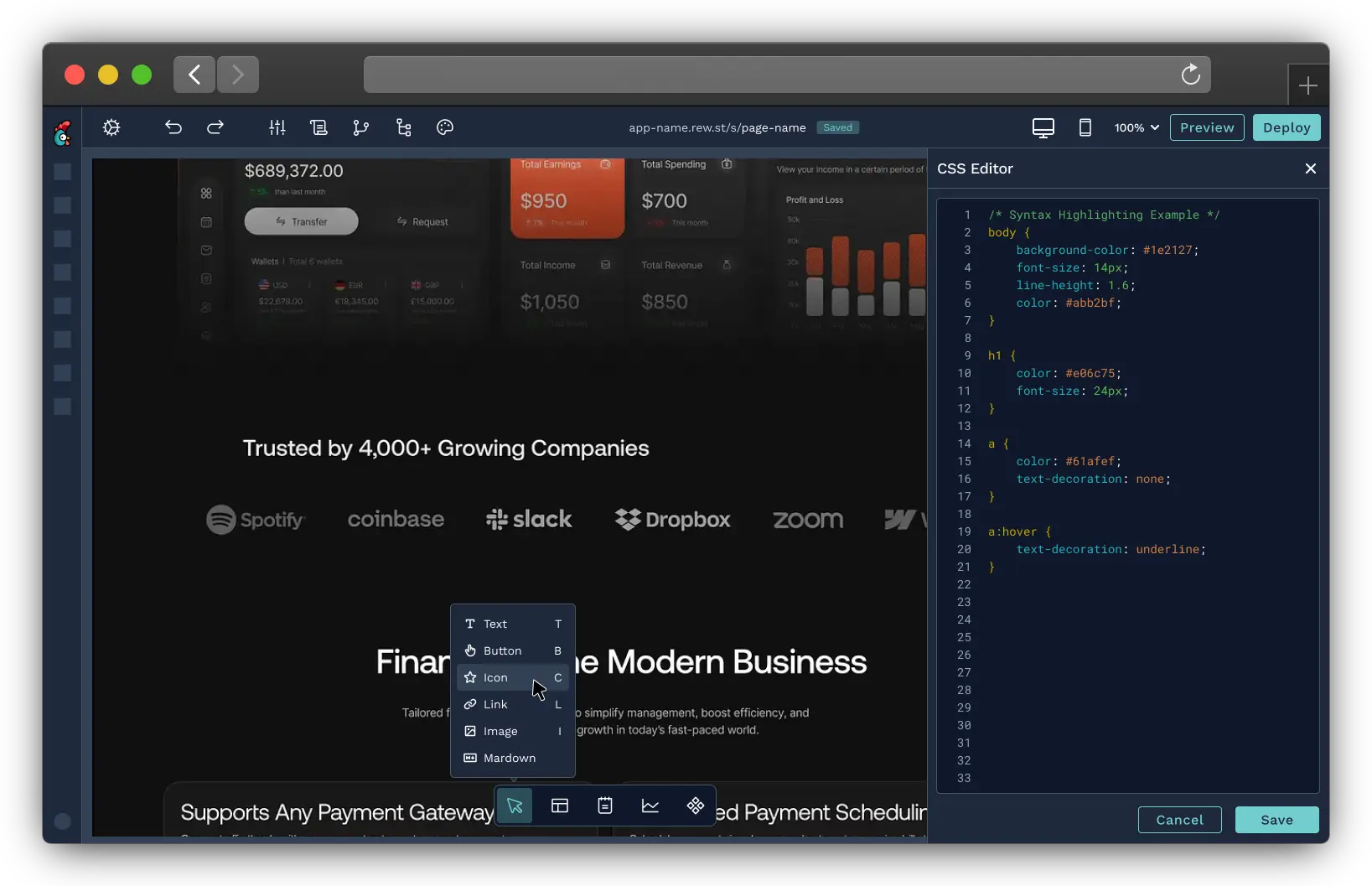
Configuration and styling are centralized through the element inspector, styles manager, and color picker. Instead of scattering options across multiple screens, customization is surfaced contextually and progressively. Users can apply consistent styles, adjust layouts, and manage colors without writing code, while still retaining the option to go deeper when needed.
Finally, preview mode enables users to validate their work in real time without breaking their flow. By allowing quick switches between editing and previewing, users can confidently iterate, test interactions, and refine their apps as they build, reinforcing a sense of control and momentum throughout the experience.
Components
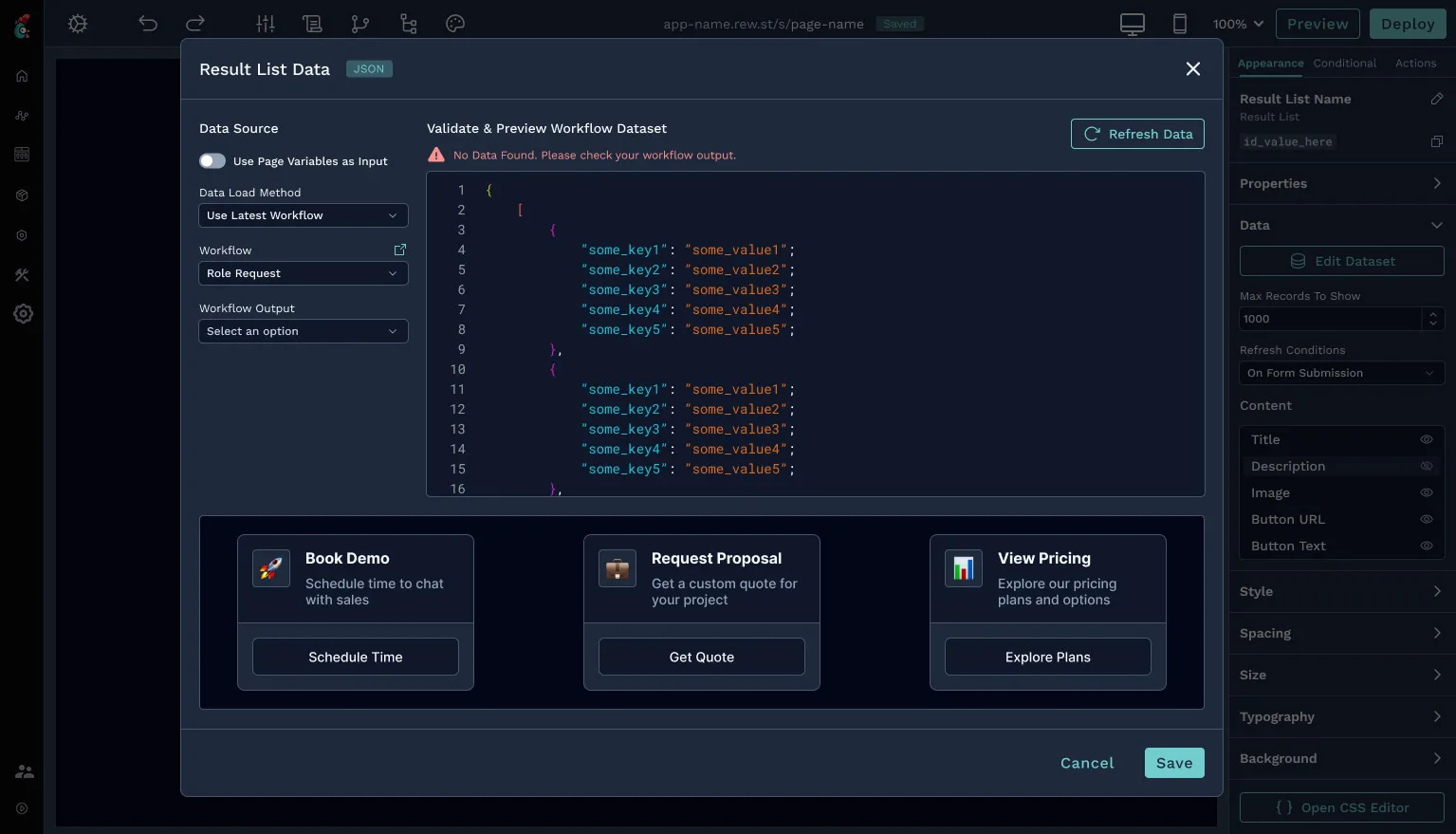
Accelerating creation with opinionated building blocks.
To help users move faster and avoid reinventing common patterns, I designed a set of opinionated, higher-level components that go beyond basic elements. These components: list displays, card-based layouts, and navigation menus—bundle structure, behavior, and styling into reusable building blocks.
These components allow users to create polished interfaces quickly while maintaining consistency across apps by providing sensible defaults and proven patterns. At the same time, they remain flexible and customizable, giving advanced users control without forcing less experienced users to start from scratch.
Themes
Designing a system that works in every mode.
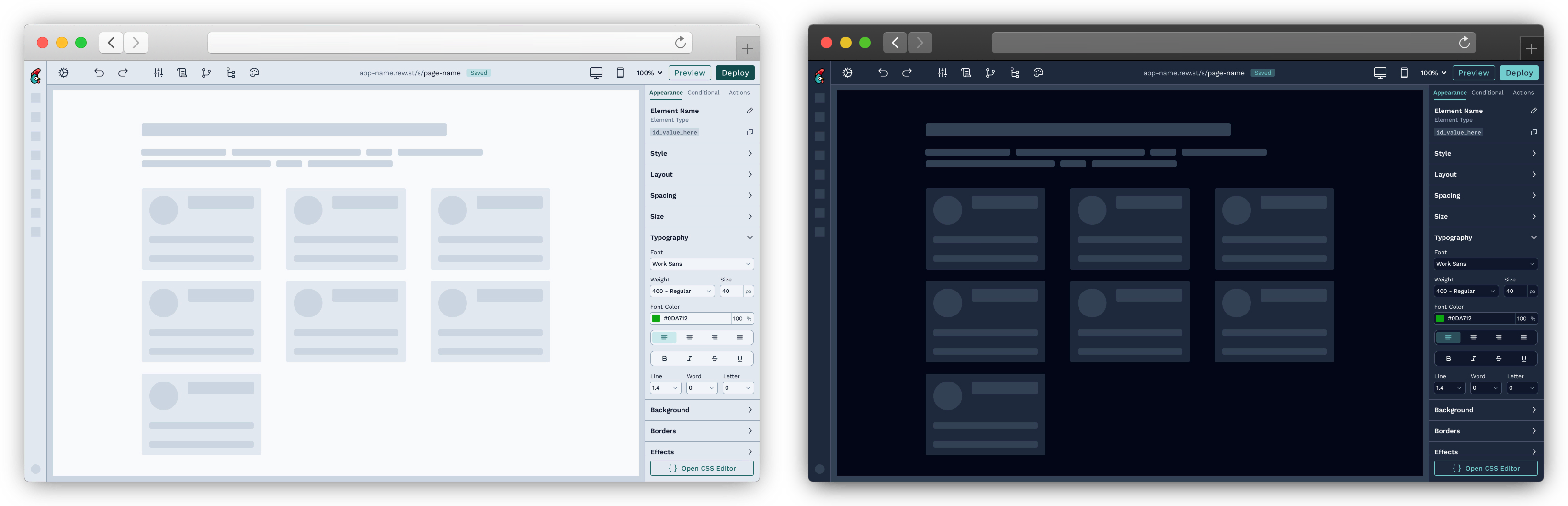
Supporting both light and dark mode required more than visual inversion, it demanded a structured, system-driven approach to color, contrast, and hierarchy. I redefined how surfaces, text, and interactive states behave across themes to ensure readability and consistency.
Anchoring both modes to the same underlying design system allows the App Builder to offer a cohesive experience regardless of theme. This solution reduced one-off overrides, improved accessibility, and made future visual updates significantly easier to scale.
Insights
Validating design decisions through real usage.
To understand how the redesigned App Builder performed in the real world, we used Pendo to track usage patterns, feature adoption, and friction points across the editor. This data helped validate assumptions made during design and highlighted where users were succeeding or getting stuck.
Monitoring how users interacted with core tools like the elements picker, inspector, and preview mode, helped me identify opportunities for refinement and iteration. These insights ensured that the redesign remained grounded in actual behavior, not just intended use.
Impact
A faster, clearer, and more scalable builder.
The redesign resulted in a more approachable App Builder that significantly lowered the barrier to entry for non-technical users while preserving the flexibility required by advanced users. Clearer structure, improved styling controls, and opinionated components helped users move from idea to implementation faster.
For Rewst, the improvements strengthened the App Builder's role within the platform, increasing user satisfaction and positioning it as a more competitive and scalable offering. The new foundation also enables the team to continue evolving the product without reintroducing fragmentation or UX debt.